Behind the project
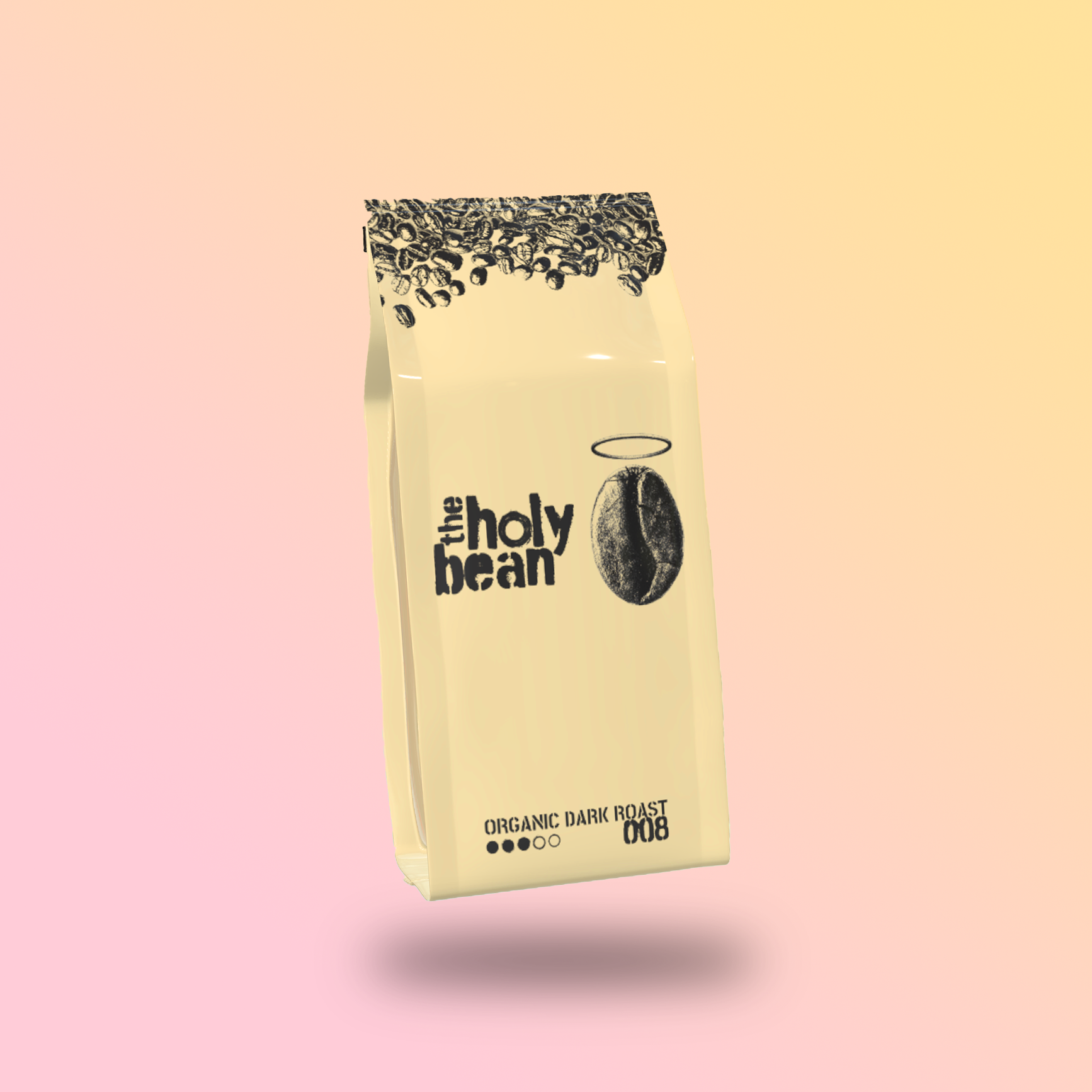
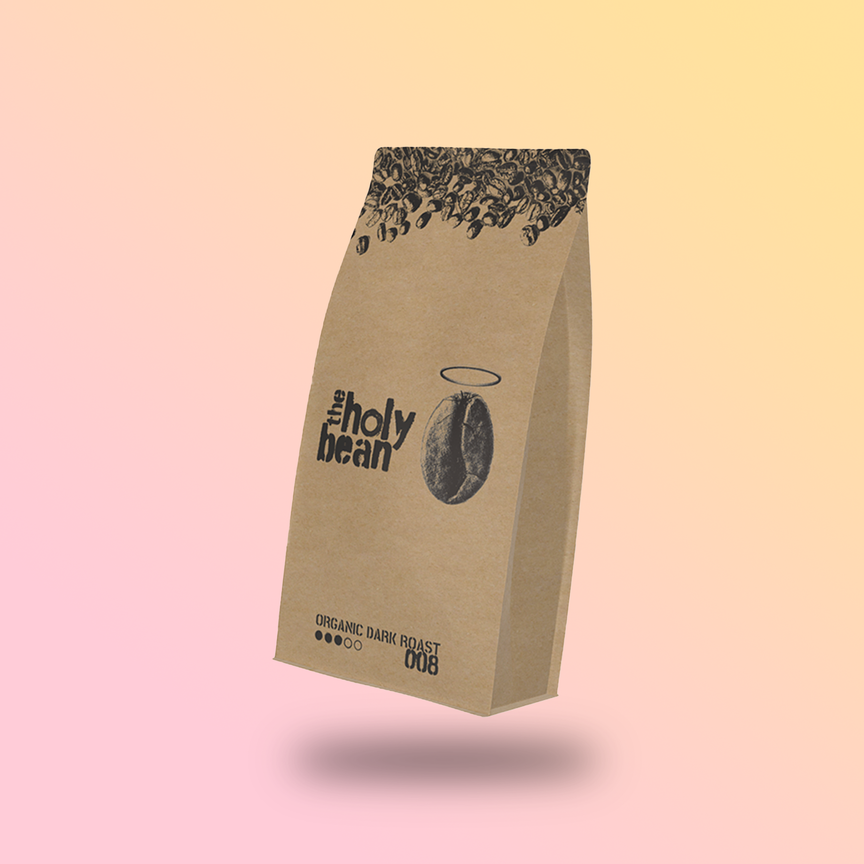
For the visual identity of The Holy Bean, I opted for a minimalist approach while integrating elements directly linked to the coffee industry. One of the key choices was the stencil font, often used on the large burlap sacks of coffee beans sold in bulk. This not only connects the branding to the historical and industrial roots of coffee but also serves as a tribute to the artisanal process behind its production. Choosing a stencil font wasn’t just about making a bold statement—it was about creating an immediate visual link between the production process and the consumer experience.
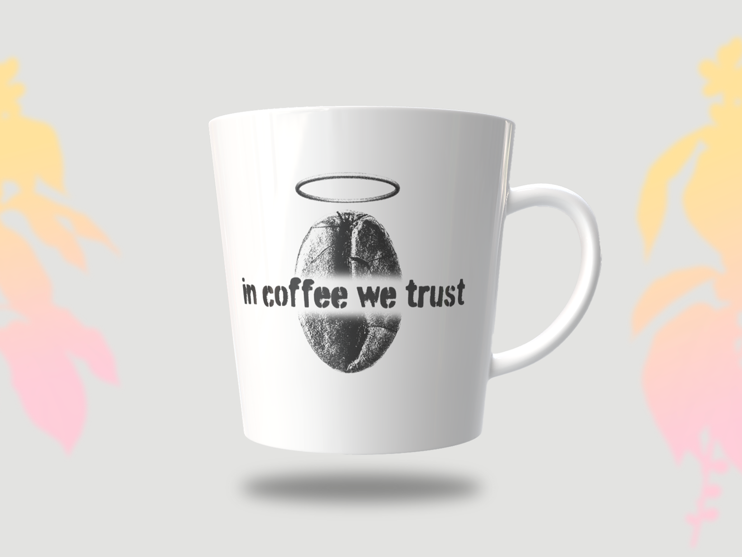
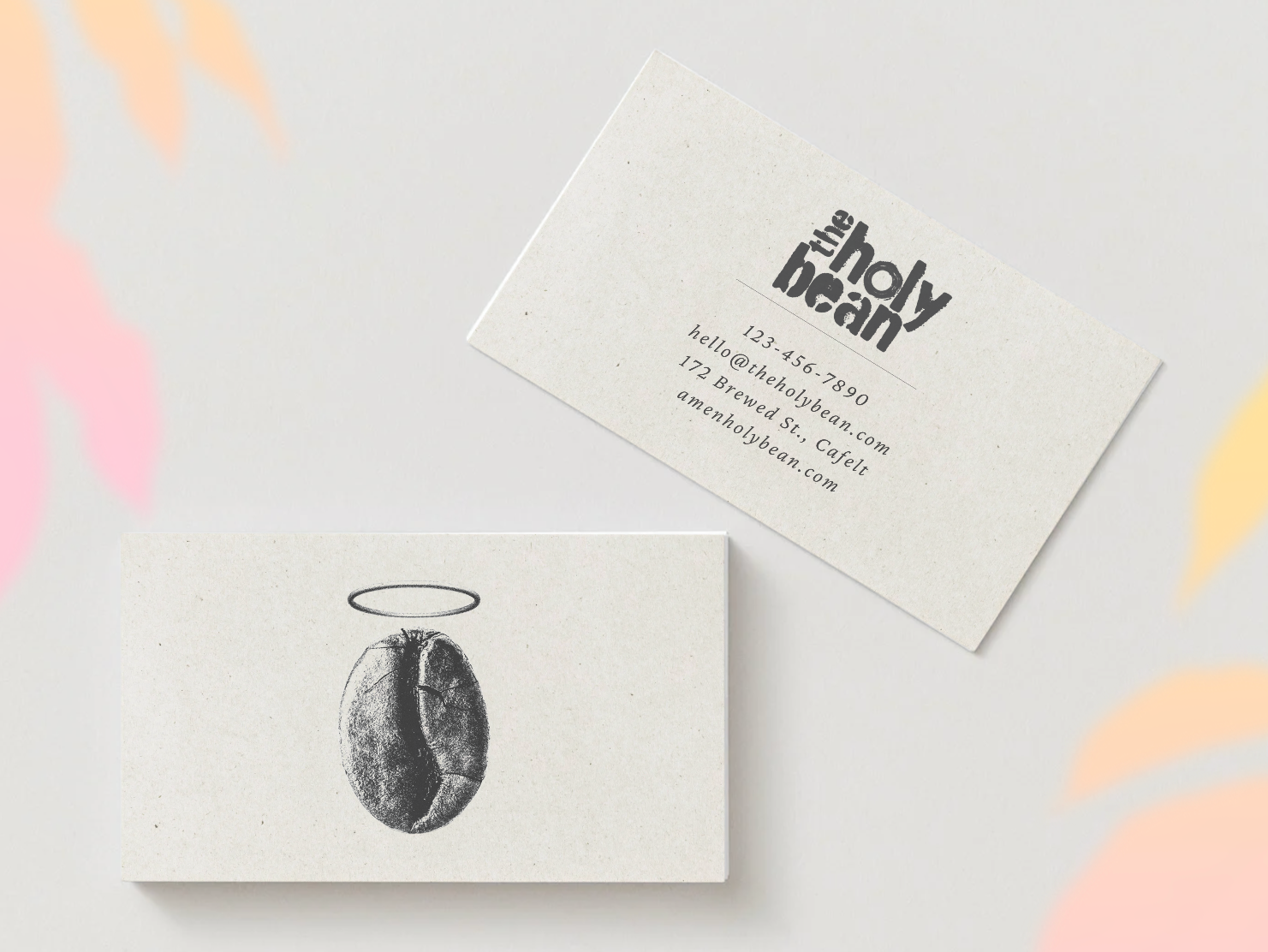
The logo itself plays with the term "holy", bringing a literal representation of a coffee bean as if it had been sanctified, complete with a halo. This subtle yet playful concept adds personality and depth to the brand’s identity.
A hidden detail in the design is the letter "o" in "holy", which is actually a coffee ring stain left by a cup—a small but intentional nod to the everyday ritual of drinking coffee. The same coffee stain image was repurposed for the “strong-o-meter”, reinforcing the organic and handcrafted feel of the branding.
Lastly, the decision to use numbers instead of blend names was a deliberate choice to maintain simplicity and make the selection process more intuitive. Instead of navigating through complex names, customers can easily find their preferred blend by searching for a simple three-digit code, streamlining the experience while keeping it efficient and memorable.
The Holy Bean is a fictional brand I created, inspired by everything I love about coffee. I grew up in the countryside of Brazil, where coffee production drives much of the local economy. I’ve seen firsthand how deeply coffee culture impacts families and communities.
In Brazil, coffee is more than just a beverage—it’s a daily celebration of life. Every morning and afternoon, when it’s coffee time, it’s also time for good conversation, a moment to connect, and share stories. Coffee brings people together.
I am currently part of Ra-Prana, a non-profit organization dedicated to providing fresh fruits and vegetables to our communities free of charge. This experience has deeply inspired me in shaping the branding for this project, reinforcing my commitment to connection, generosity, and meaningful impact.

You may also like

Back to Top