_____________________________
BEHIND THE PROJECT
I embraced the challenge of designing an upscale restaurant menu using only shades of blue. A task that perfectly aligned with my passion for minimalist design.
Starting with the menu's background I developed a deep blue gradient, inspired by the restaurant’s name, to evoke a celestial, mysterious, and sophisticated tone. This gradient became the ideal choice, creating a sense of depth and elegance. To enhance the visual texture, I introduced a subtle grainy effect.
To further reinforce the moon-inspired theme, I incorporated delicate circular outlines, strategically balancing the space and complementing the menu layout. Every detail was thoughtfully placed to ensure a harmonious, refined aesthetic.
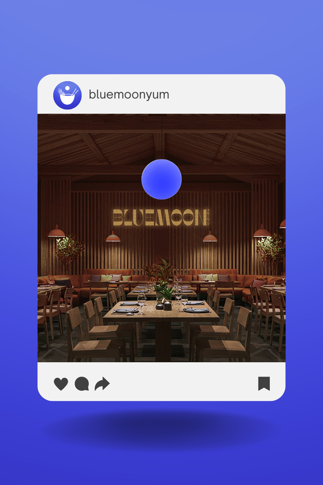
In addition to the menu design, I also created the BlueMoon logo, selecting a modern, geometric typeface that seamlessly integrates with the overall concept. To further connect with the restaurant’s Japanese influence and clientele, I incorporated the Japanese translation of "Blue Moon" (ブルームーン) into the design, adding an authentic cultural touch. For the menu itself, I chose clean sans-serif fonts, ensuring a minimalist, sophisticated design that makes the menu complete.
For the emblem logo, I wanted to create something simple yet meaningful that tied into the restaurant’s identity. The bowl shape was actually made using half of the letter “O” from the restaurant’s main logo, keeping a subtle connection between the two. I added a pair of chopsticks to represent Japanese cuisine and a palm leaf as a nod to Hawaii. To bring in the Blue Moon theme, I placed a small circle above the bowl to symbolize the moon. The result is a clean, balanced design that reflects both the restaurant’s cultural influences and its name in a subtle way.

